Accessibility
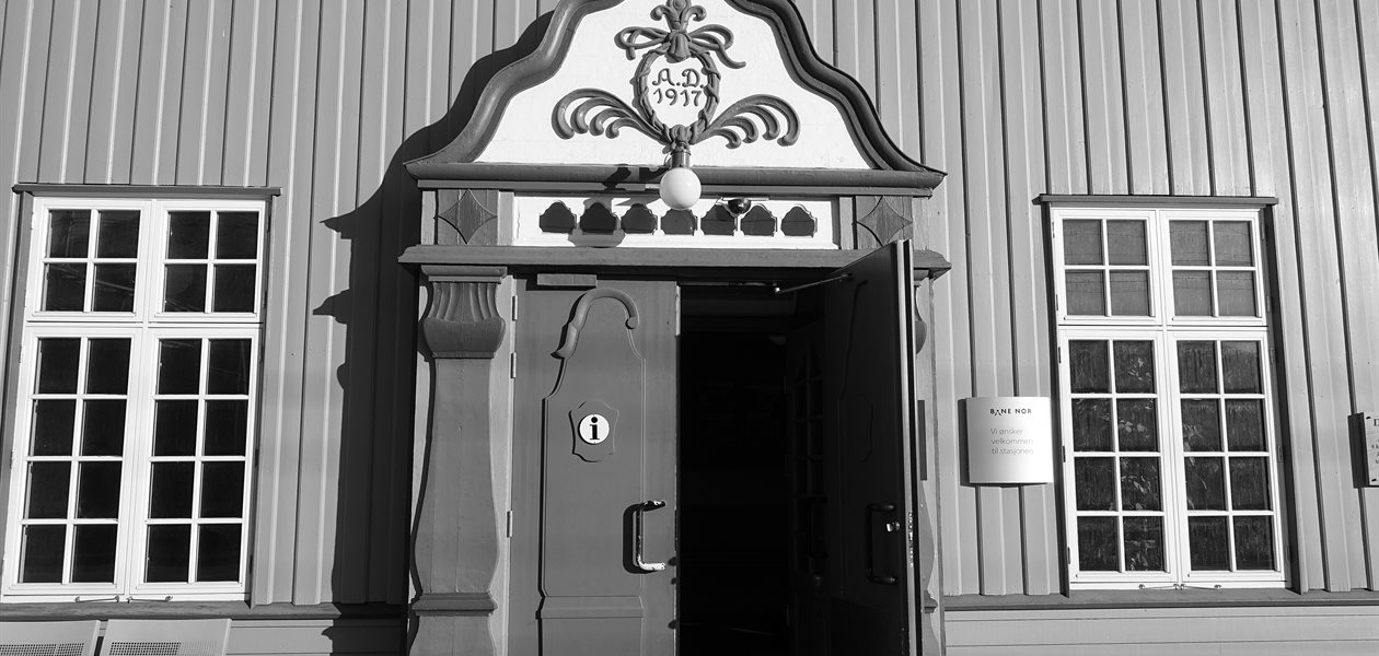
Oppdal station, Norway — photo: Wolfmann, CC BY-SA 4.0, via Wikimedia Commons; converted to black and white
Last updated 29 September 2026
This is a site for reading. If any part of it gets in the way of your reading it, that is a fault on our side, and we would like to know. Below is the standard we build to and what that means in practice.
In short
- We aim at WCAG 2.2 Level AA, the standard the European Accessibility Act points to.
- Everything works with a keyboard alone, and the focus outline is always visible.
- Nothing moves that you cannot stop.
- Text can be enlarged to 200% without anything being cut off.
- An Accessibility switch in the top-right corner enlarges the country names in the continent menus.
- If something blocks you, tell us and choose the topic "Accessibility Problem".
What we build to
The target is the Web Content Accessibility Guidelines 2.2 at Level AA. That is the level the European Accessibility Act and the UK public sector regulations both point at, and on a site that is mostly words and photographs it is achievable without compromising anything.
We treat it as a floor rather than a badge. Somebody reading a timetable on a phone in bright sunlight needs the same contrast as somebody with low vision; somebody whose trackpad has stopped working needs the same keyboard support as somebody who never uses a mouse.
What is in place
Keyboard
Every link, button, menu and form control can be reached with Tab and used with Enter or Space. The continent menus in the header open from the keyboard and close again with Escape. There is a "Skip to main content" link as the first thing on every page, so you do not have to tab past the whole country menu to reach an article. Wherever the focus is, there is a gold outline around it.
Movement
The photographs at the top of the home page and the picture galleries inside journey articles change on their own. Both carry a pause button, and both stop entirely if your system is set to reduce motion — as do the page's transitions and the smooth scrolling.
Reading
Body text meets the 4.5:1 contrast ratio the standard asks for, and headings and buttons meet theirs. Article text is ranged left rather than justified, and line lengths are capped, both of which make a long paragraph easier to track. The pages survive being zoomed to 200% and being read on a 320px-wide screen without scrolling sideways.
Titles over photographs
Every country and journey title sits on top of a photograph. Rather than trusting that to look all right, we measured it: each of the 210 header images was sampled pixel by pixel underneath the letters of its own title, at five screen widths from a phone to a wide desktop. The contrast comes from a dark edge drawn tight around the letters themselves, which means the photograph underneath is never tinted or dimmed to make the words work.
Images
Every photograph in a journey gallery has a caption printed underneath it — all 1,018 of them. The picture itself is marked as decorative so that a screen reader reads that caption once, rather than the same sentence twice for one photograph. The pictures on the cards — places, experiences, hotels and the journey cards on a country page — work the same way: each one has its name printed directly beneath it, so the photograph is marked decorative and the name is read once.
The large photograph behind a country or journey title is marked decorative for the same reason: the title is printed across it and names it. The headers on these footer pages are described instead, because "Copyright" or "Accessibility" tells you nothing about the buffer stop or the open doorway underneath it. The small grey line in the corner of those is a photographer's credit, not a description — it is read out where it appears, but it is there to satisfy the licence, and it is not what makes the image understandable.
Embedded video and maps
The video players and the map on the home page are other companies' markup, and their accessibility is not ours to fix. None of them loads until you ask it to. The map cannot be used with a keyboard, so every country and journey it points at is also reachable from the menus and the country pages — and always will be.
The accessibility switch
A few things cannot be right for everybody at once. The country names in the continent menus are set small, which suits the design and does not suit anyone reading with low vision. So the Accessibility button in the top-right corner of every page enlarges them.
It is deliberately a short list. Anything that can be put right for everyone is put right for everyone rather than hidden behind a button most people never press. Your choice is remembered on your own device and nowhere else — see the privacy policy.
Telling us about a problem
Use the contact form and choose the topic "Accessibility Problem". It helps if you can say which page it was, what you were trying to do, and what you use to browse — but do not let missing any of that stop you from writing. A sentence is enough.
We read every message. If something is blocking you outright, say so and we will treat it that way rather than putting it in a queue.